Striking and strategic KeepCup branding by Frost*collective
KeepCup is the original and arguably the best reusable coffee cup in the world, and they’ve gone from strength to strength since their launch in 2009. These are the guys who started the “reuse revolution” in Australia, and they’ve turned to Frost*collective to supercharge their branding and packaging.
[Sassy_Social_Share]And guess what? It’s not bad, not bad at all.
The challenge? Reinvigorating the reuse revolution
KeepCup have a very strong and bold mission, with sustainability at the very core of their business. But with every man and his dog shoving the sustainability message at us, (including us, ironically), it was time for the message to be revised, rehashed and reinvigorated.
The Strategy: Reclaim their crown as King of Cups

With sustainability being awash with new brands, buzzwords and wannabe’s with a similar mission to their own, they had to reclaim their title as the King of Cups. The challenge for Frost was to build on their classic and recognisable brand and have a visual system that united their full range of products.
The execution: Keep the KeepCup name

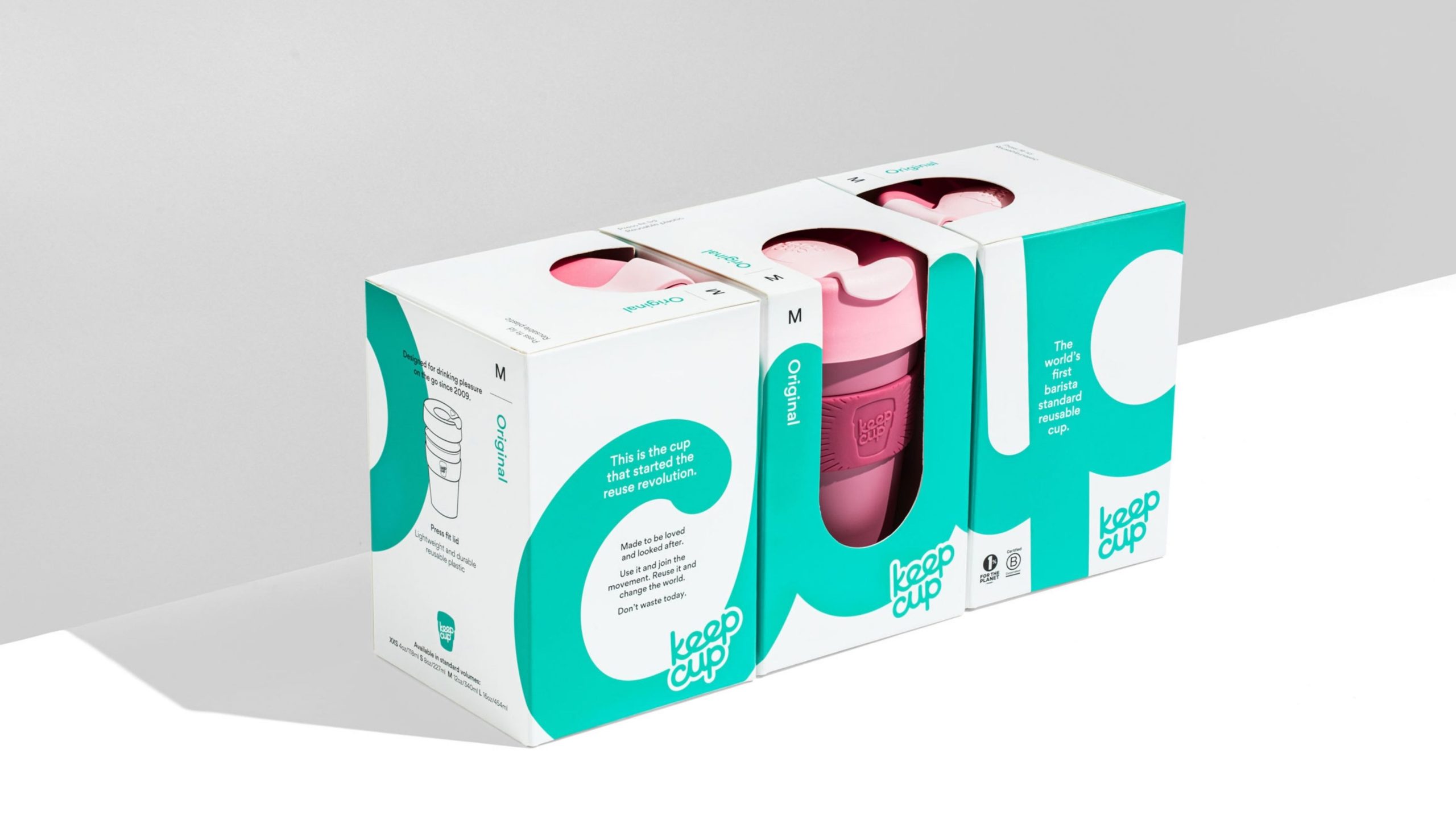
“This is the cup that started the reuse revolution. Made to be loved and looked after. Use it and join the movement. Reuse it and change the world. Don’t waste today.”
<< The new KeepCup call to action >>
Frost*collective recognised that the name itself was its key asset – the “hoover” of the reusable cup world.
“Retaining the brand’s simple, honest and playful approach to a serious issue, we redesigned the retail packaging to assert itself in the category, heroing its key brand asset – its name – to break through the competitive noise.”
The new packaging construction has a strong and attractive wrap around design which clearly displays their new brand story and call to action:
This is the cup that started the reuse revolution. Made to be loved and looked after. Use it and join the movement. Reuse it and change the world. Don’t waste today.
Nicely done, Frost!
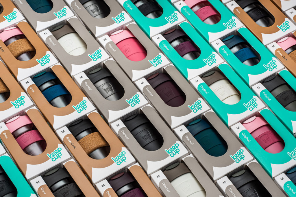
The new KeepCup packaging
The new KeepCup packaging is carefully thought out to stop the cups getting squashed or smashed when in the loving hands of the delivery drivers, or just generally making their way from point A to B.
The packaging has handy illustrations on the back so that you can see all the features, benefits and other nuggets of useful information. Or, in Frost’s words: “The redesign has reasserted KeepCup’s positioning and values, reduced breakages and mailer material, while creating a clear and robust range architecture, visual language and logic that incorporates future products as KeepCup continues on its mission.”
Oh, and did you notice that if you get three and pop them next to each other, the text lines up, all nice and orderly, and the “cup” wording is complete?
Boom.
The results? Looks epic, happy customer, lots of awards

Sounds like KeepCup were pleased: “We have had much less breakage, both in B2C and B2B shipments. We’re very happy with these results.”
They also won a couple of awards.
Silver – 2020 ANZ Transform Awards, Category: Best Use of Packaging
Winner – 2020 Good Design Awards, Category: Communication/Packaging
Good on ya, mate!
About CoffeeCode
This article was written by Gregg Romano who is the founder of CoffeeCode, the UK’s fastest growing and most exciting coffee blog. CoffeeCode has a focus on great coffee, inspirational design and sustainability.
Credits:
All credit to, and information from:
We always do our best to attribute photos, videos and quotes and information to their original sources. Please contact us if an attribution or content is missing or incorrect.